PROJECT
Studio ADASH
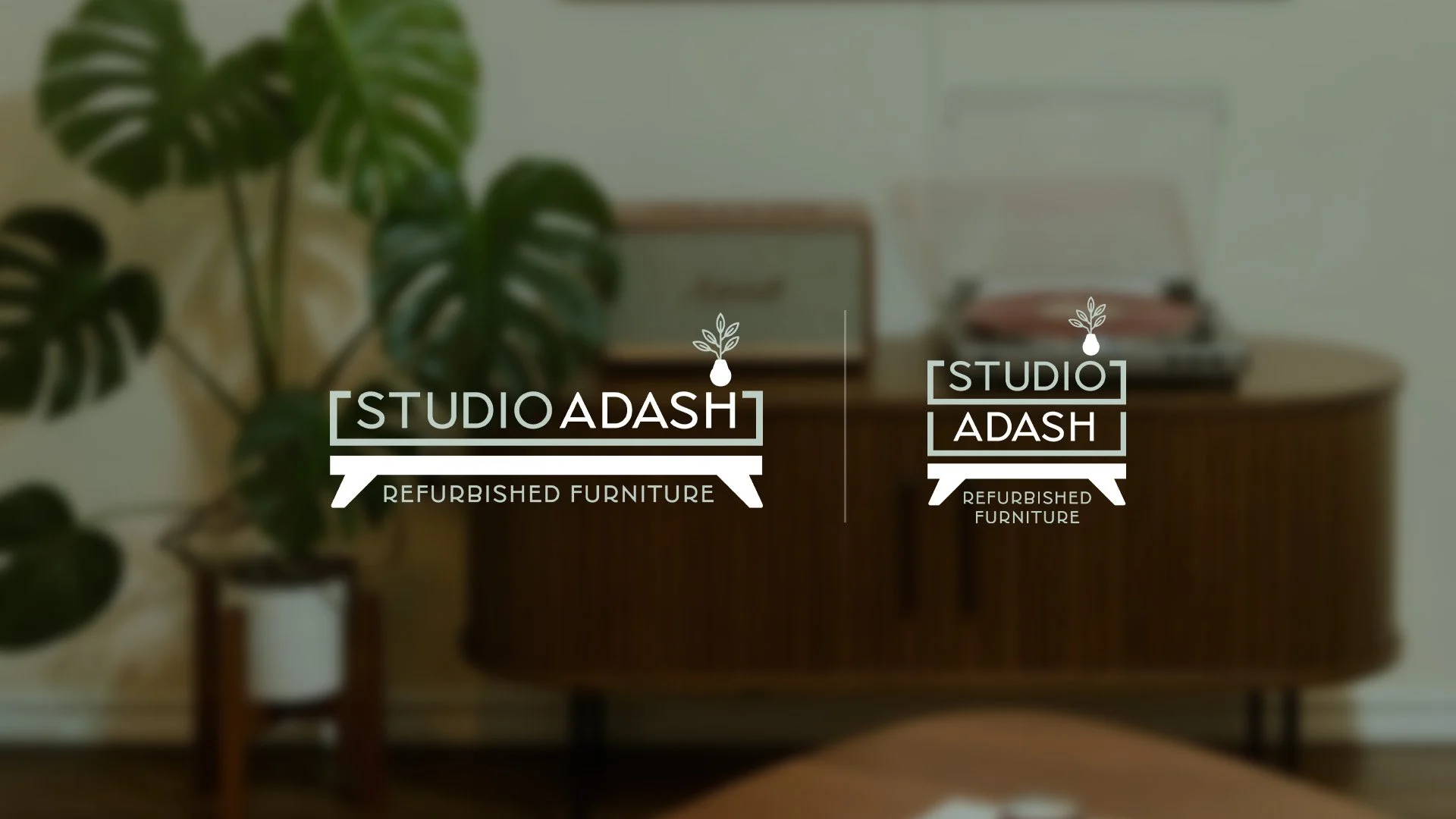
Ashley Brandfass— social media DIY influencer with over 330k followers on Instagram (@studio_adash) and owner of Studio ADASH—was seeking a stronger brand. From the ground up, we crafted a new logo system and visual identity to represent her mid-century modern furniture refurbishing style.
Here’s the full breakdown of The Mega Creative Company's proven logo design process that details how Studio ADASH's logo came to be.
Influencing a brand with a whole new visual look.
With 334k followers on Instagram, 110k followers on Tik Tok, 129k followers on Facebook, 92k subscribers on YouTube*, an Amazon and LKT storefront, and a website, the Studio ADASH brand is prevalent in many areas all at once. In order to continue to propel this DIY business further, these touchpoints needed cohesion, a sense of unity, and an easily recognizable and relatable logo.
Careful listening to the client and extensive industry research lead to a logo design that feels fresh, hits on meaningful mid-century modern visual goals, and creates an overarching home for a growing brand.
*As of early 2026.
Let’s rewind and see how we got to the final logo.
Before the pen hits paper and the mouse starts clicking, the first thing Megan does is hold a kick-off meeting. Here, she conducts a brand-related interview with the client, identifying key areas to represent, key areas to avoid, and overarching goals.
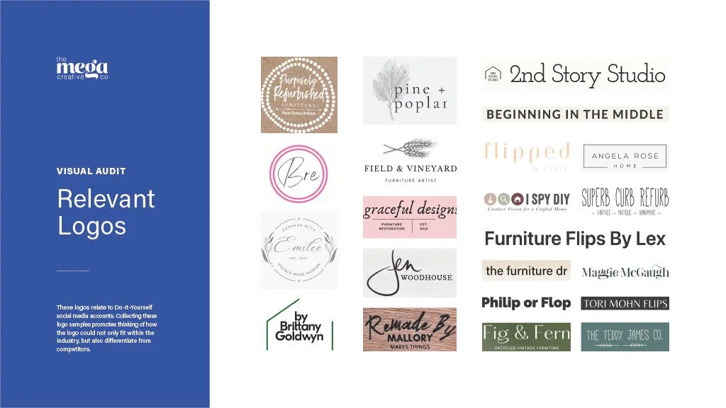
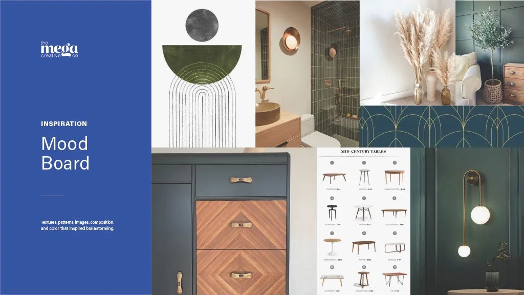
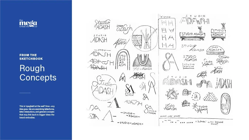
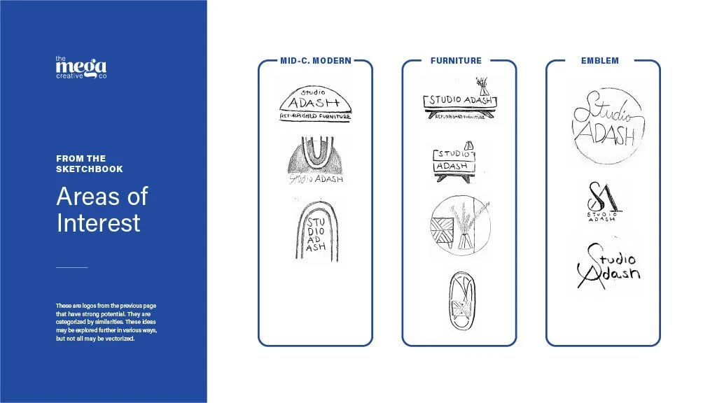
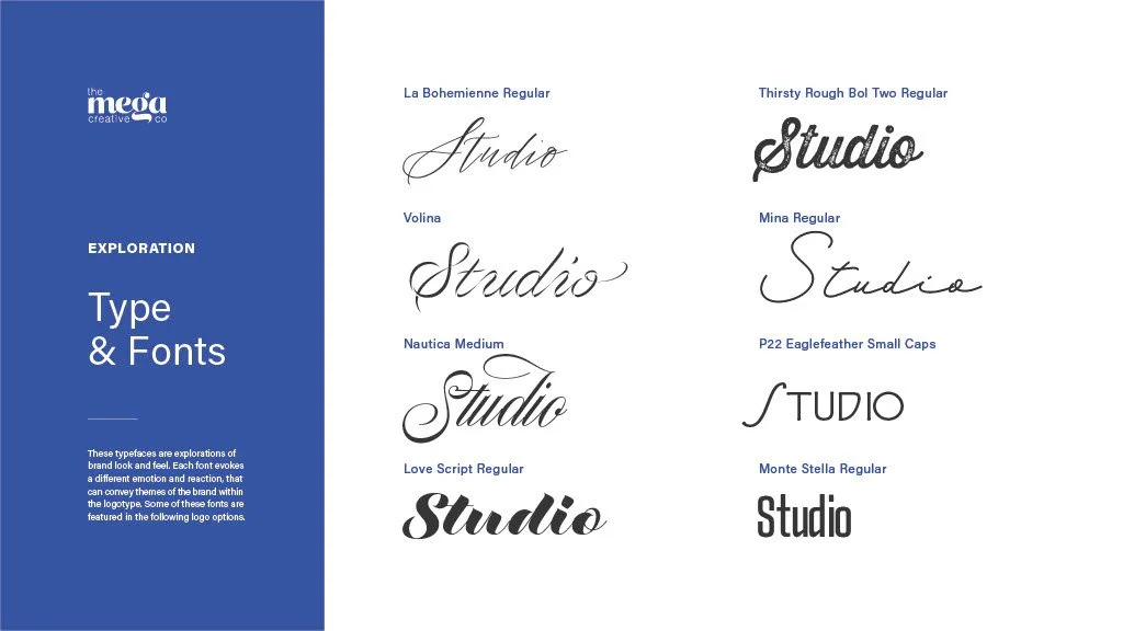
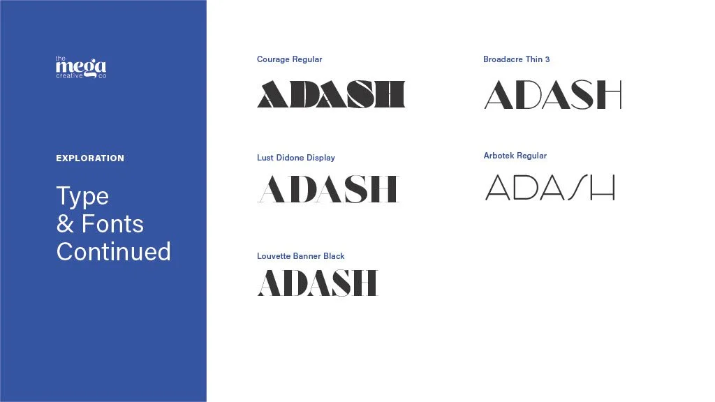
Megan then uses this information as a guiding light as she conducts industry, naming convention, and visual audits. Fueled with this research, she moves on to typographic studies, no-frills sketchbook ideation, and finally vectorizes the selections that have the highest possibilities for success.
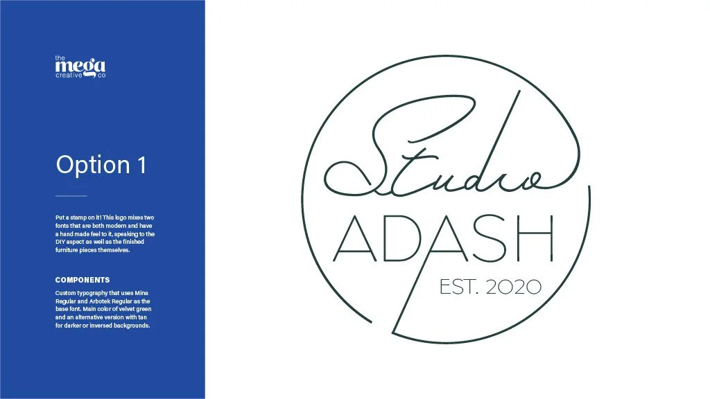
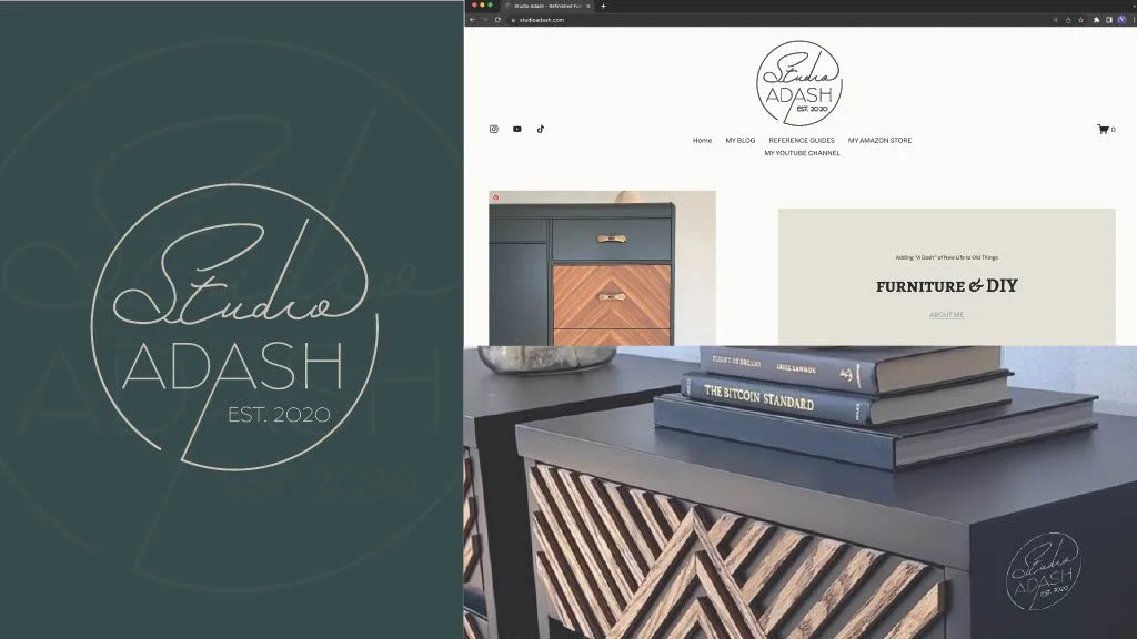
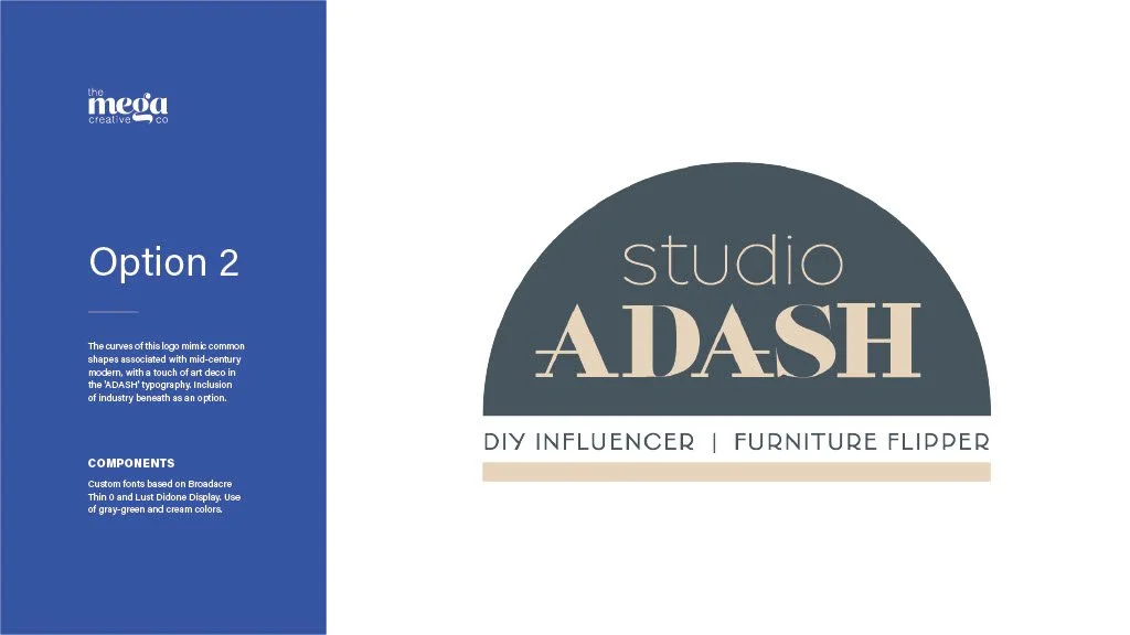
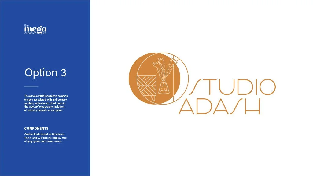
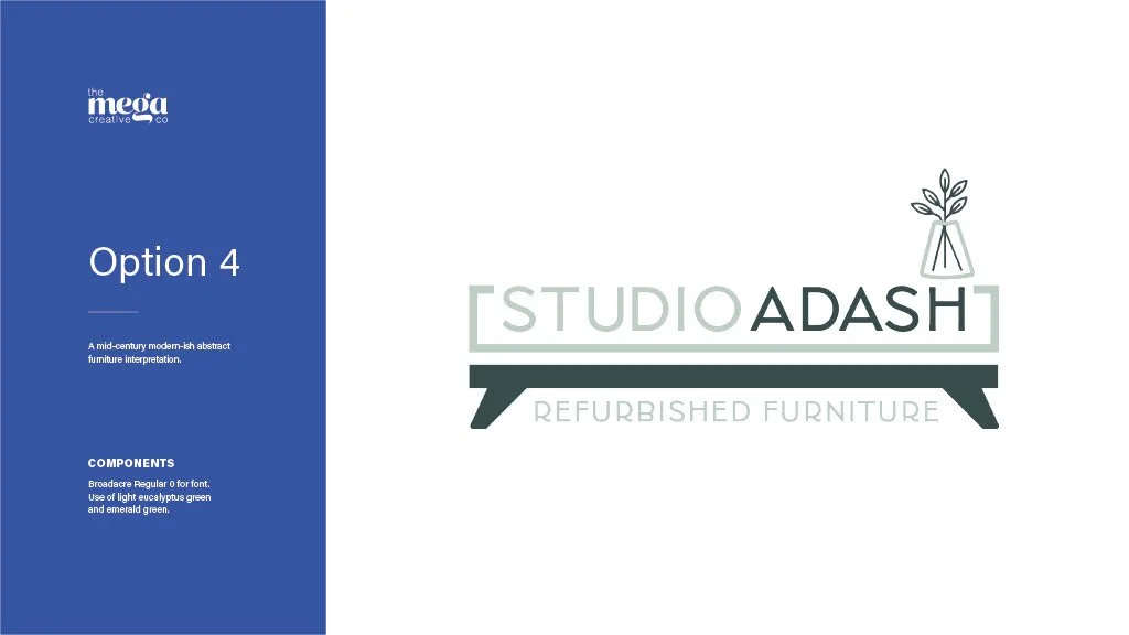
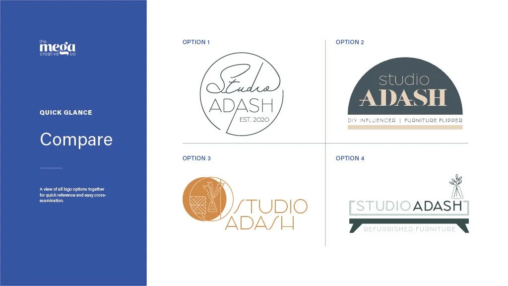
Below is the first-round pitch deck that was presented to the client, and serves as a process and inclusion example of what all logo and branding clients may receive. The first round always serves as a directional gauge and isn’t intended to be the final product. Even if a logo is selected from this round as-is, it will undergo further, more scrutinized refinement in order to deliver a pixel-perfect product.
Time for iteration.
During the first round pitch meeting, initial reactions are documented, but Megan recommends that no final decisions be made on the spot in order to think about each option thoroughly and the brand holistically. Armed with clear client feedback while always recommending best practices, we then can tackle the next round based on a chosen path forward.
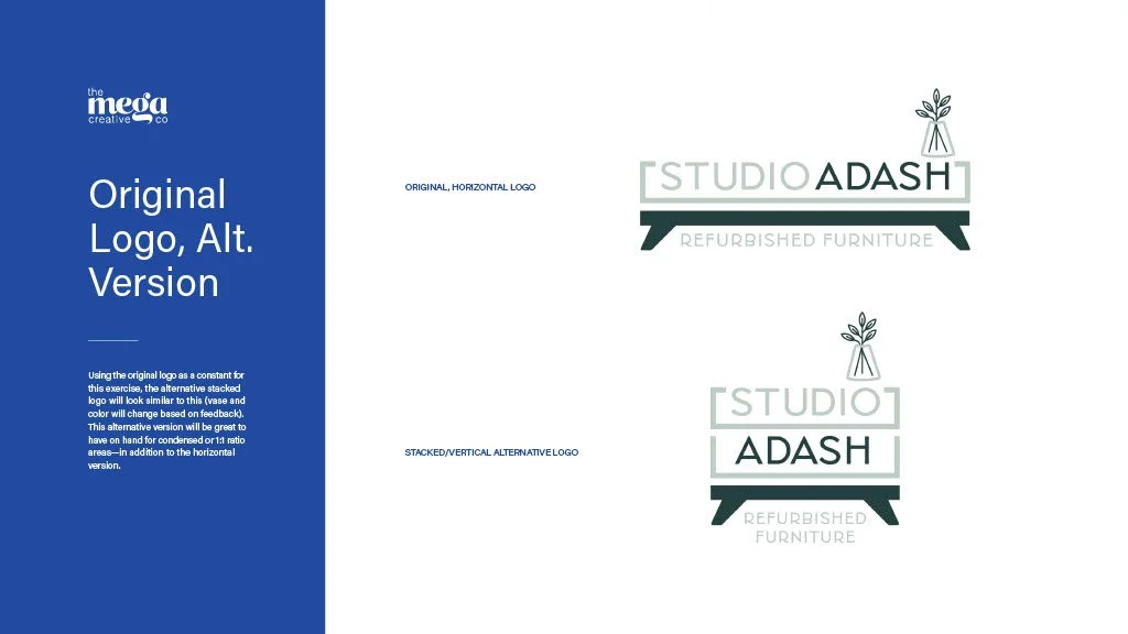
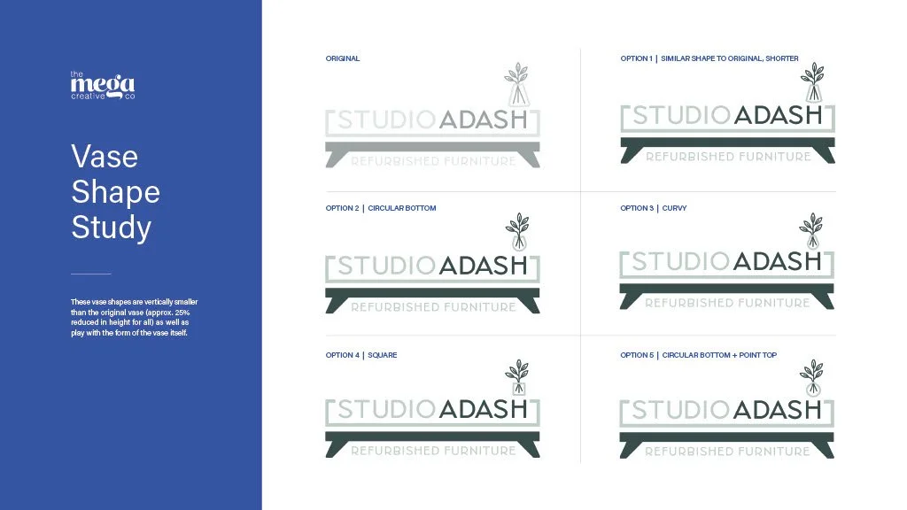
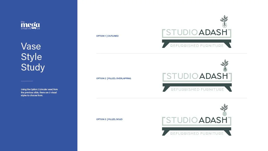
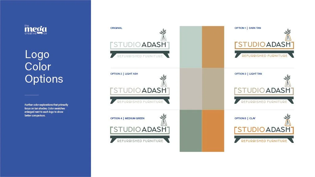
In this instance, the second round featured further exploration around color and the look of a brand mark component (i.e. the floral vase).
The logo in action.
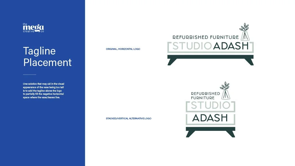
It was also important to have a flexible logo for every space the Studio ADASH brand shows up. This included different tagline variations, configured in two lockup forms, in seven color applications, and in two different file types—this resulted in a total of 186 files provided at final project handoff.
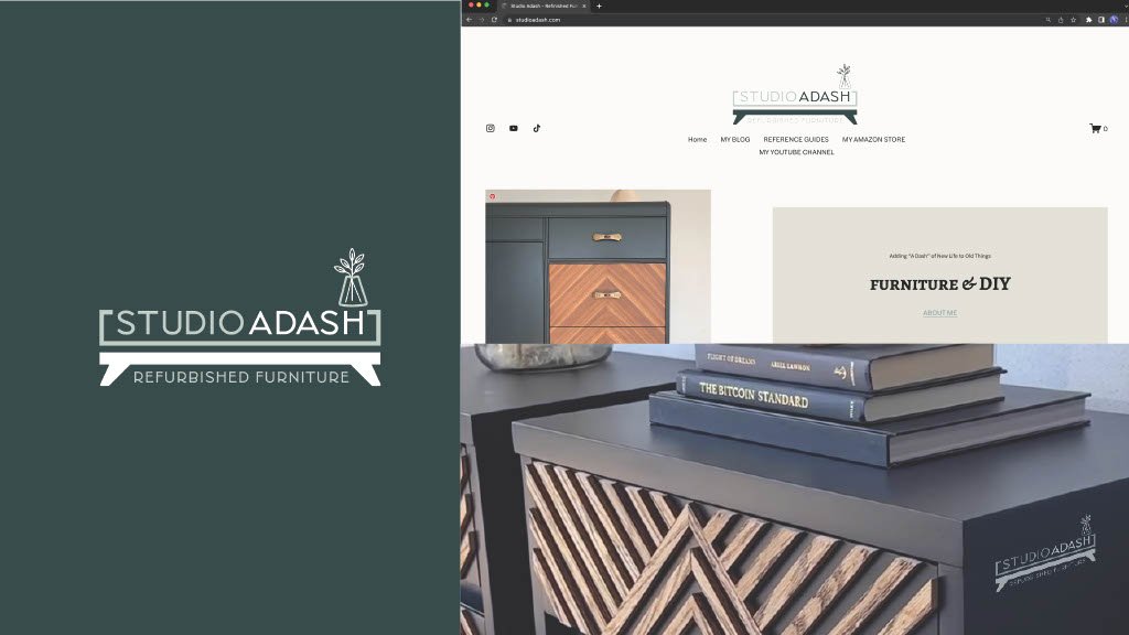
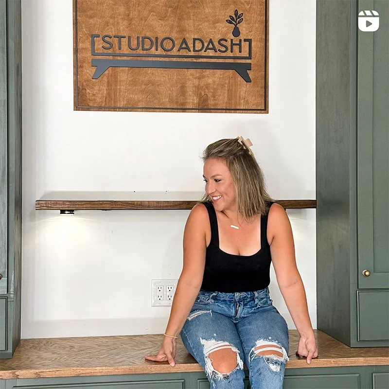
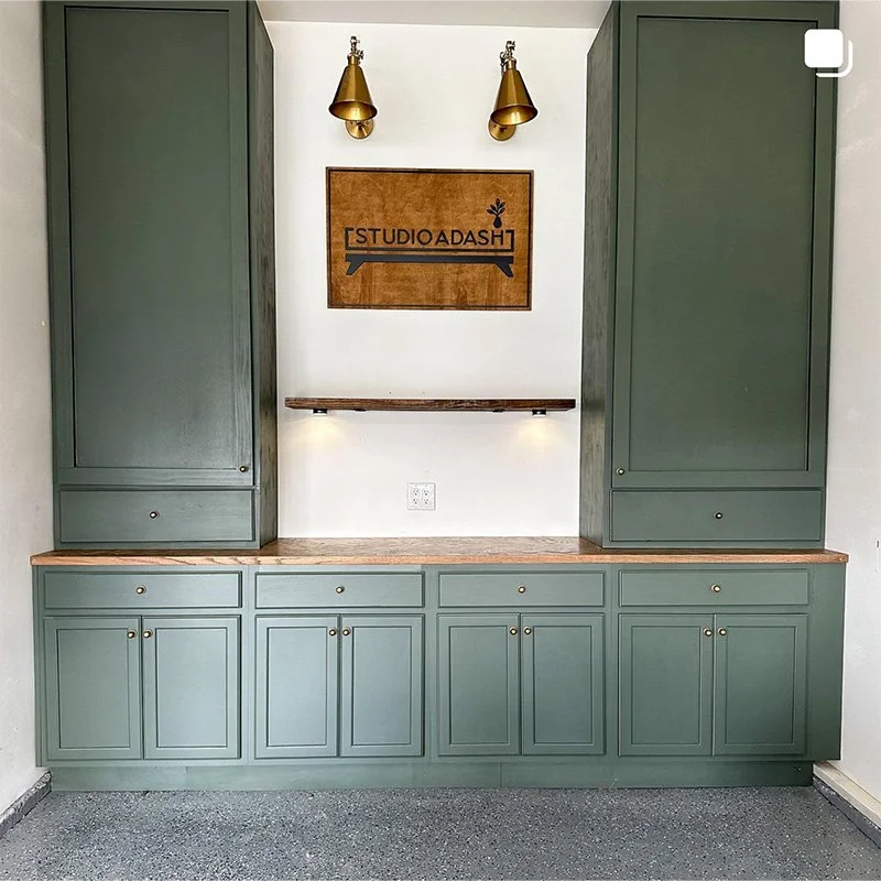
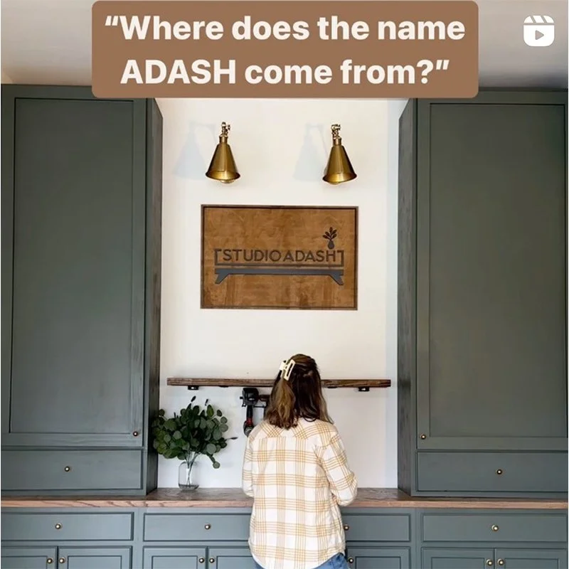
These are a few images taken directly from the @studio_adash account that proudly features the final logo brought to life in Ashley’s workshop.
"Megan was absolutely amazing! I honestly had no idea what I wanted as the end result but Megan was able to help me figure out what I wanted and delivered an amazing logo! She listens to everything you want and delivers beyond expectations! Loved working with Megan and would recommend her to anyone and everyone."
— Ashley Brandfass, Owner of Studio ADASHView more featured projects

