The Proven Logo Project Process
The Mega Creative Company's logo process is a proven method that yields the same result every time it is replicated: success. Over the years, the below process has been fine tuned, adjusted, and repeated over 50 times to achieve long-lasting impacts on a variety of brands.
The process is broken into five primary phases, each phase includes with multiple steps along the way:
Phase 1: Initial Consultation Call + Pre-Work
The Mega Creative Company offers one complimentary consultation call with each client prior to contract signing and work initiation. This meeting's purpose is to establish the relationship, introduce ourselves, and to better understand your project needs—all with no strings attached.
Typically, the client gets in touch with The Mega Creative Company via the form on our Contact page, direct email from a referral, a message on LinkedIn, or from personal outreach and networking events our founder, Megan Dotson, attends. Once Megan receives the initial inquiry, she will reach out with a formal introduction email and proposal for a meeting time. She is happy to use the video call platform of your preference: Google Meet, Microsoft Teams, and Zoom are all popular and acceptable platforms. In the meantime prior to the meeting, we will review your organization's website (if applicable for pre-established brands) to learn more about your current brand and research the general industry to establish a baseline of knowledge.
During our pre-arranged meeting, Megan Dotson will introduce herself and the company, as well as provide any initial observations on your brand. The primary focus of the meeting will be to better understand the client's needs, scope of work, and intended timeline.
After the call—and if both parties deem the relationship to have a successful future together—Megan will compile the following items for the client's review:
Project Proposal: to include projected timeline, price structure, scope, and deliverables
Contract: The Mega Creative Company has a ready-to-go contract that can be adjust for each client. Alternatively, we are happy to review and work within a contract delivered by your team (subject to amends).
Examples of similar work we've previously completed (if applicable)
Once the client and The Mega Creative Company agree to the contract terms, project scope, and timeline, we need two things before the work is added to the queue:
Both parties signing on the dotted line of the contract
Half of the investment amount as a deposit (unless otherwise discussed)
Phase 2: Work Kick-Off + the First Pitch Deck
Hooray—now we are working together!
We like to officially begin each logo project with an internal kick-off meeting. Think of this meeting as The Mega Creative Company interviewing you on your company's goals, initial thoughts or preconceived ideas, expectations, any must-haves, and—as equally important—any must-nots.
The first thing we tackle is research and industry-specific acclimation. We call this mini phase, "pre-work and thinking." Think back to grade school math—the teacher always said, “show your work for full credit.” This exercise does just that as we conduct the following:
-
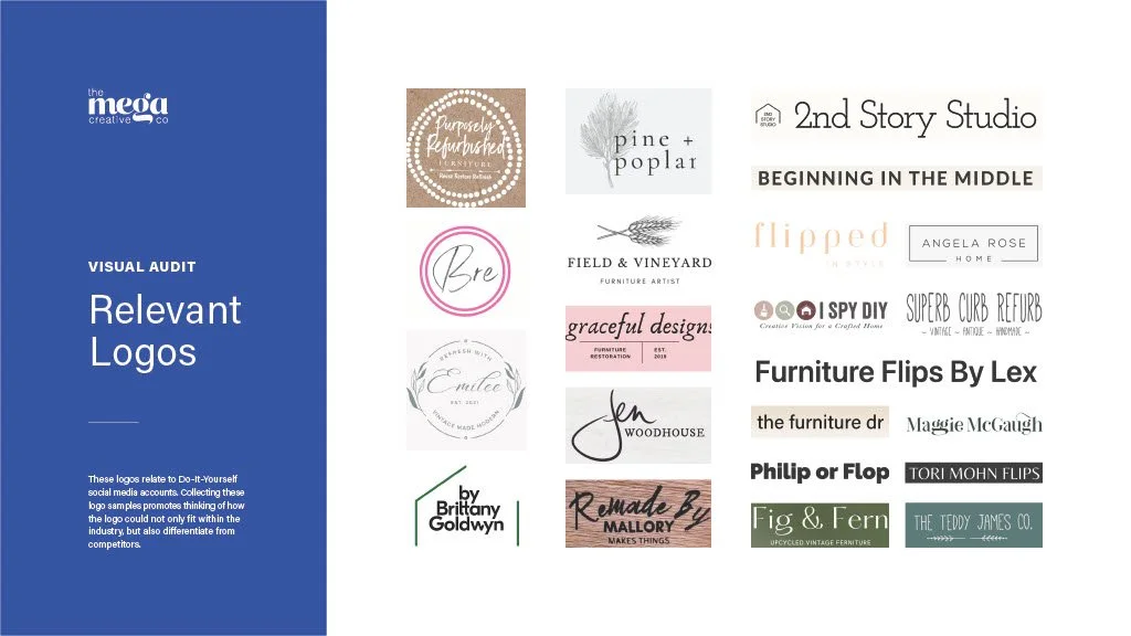
This allows us to understand key trends in your industry such as symbolism, color, and naming conventions. This is a key step to understand how your company can fit within your designated industry, as well as how you can differentiate yourselves among the relevant group.
-
If your company is undergoing a re-brand, we will request and collect a wide variety of your branded materials such as: the current logo files, website, packaging, print collateral, advertisements, stationery, and any other items you feel tells the company's current story. This knowledge allows us to understand how the company is currently being conveyed. From this, we're able to see what may be working well and what is not working for the team as far as the brand and visual identity system is concerned. This step also ensures we aren't creating something that your company has done before.
-
Not only is it important to understand how your company is positioned within competitors, it is equally as important to understand how it is visually distinguished from companies that have the same or similar name. Again, we like to avoid unintentionally creating something that has been done before.
-
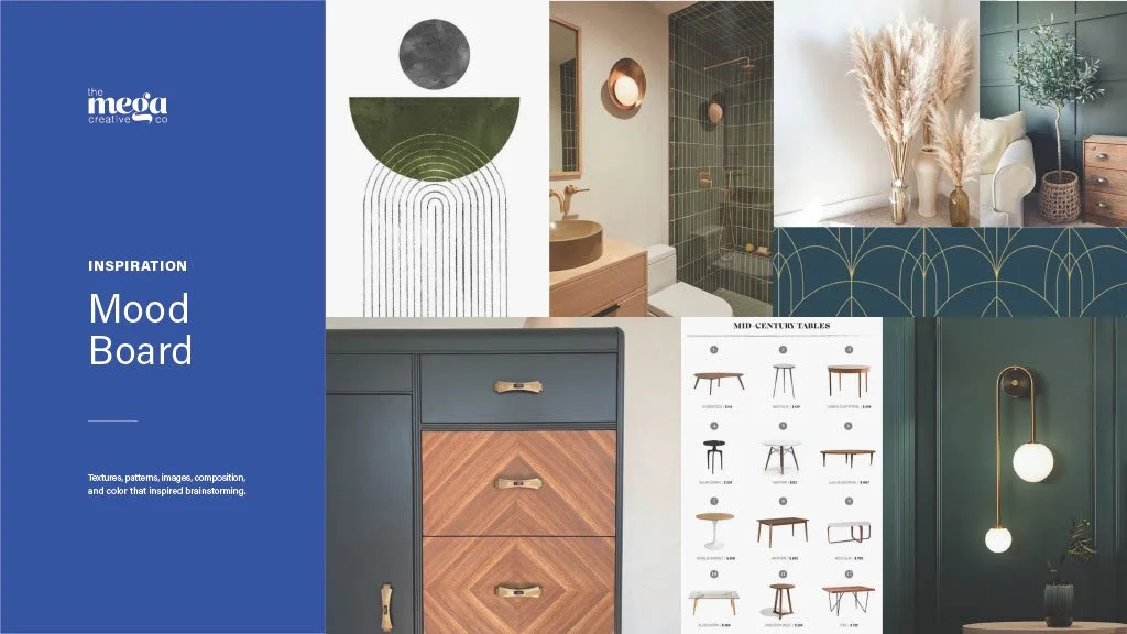
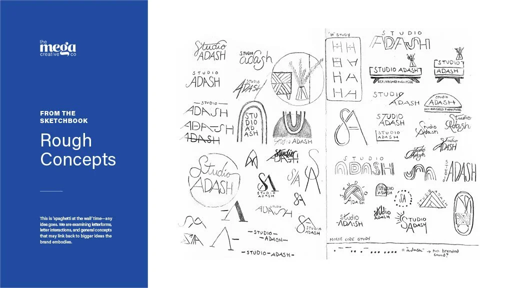
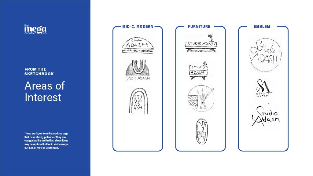
Old-fashioned paper and pencil is the first place we start when conceptualizing your brand's new face of the company. This is what we deem "spaghetti at the wall" time—any idea goes. We examine letterforms, letter interactions, and general concepts that may link back to bigger ideas the brand embodies. There is no set-in-stone number of sketches we complete, but it usually averages around 50+ separate sketches. We go until we find several ideas that we feel have potential to grow legs. We then group selected sketches into key categories that have visual and/or conceptual similarities—we call these selections "areas of interest."
-
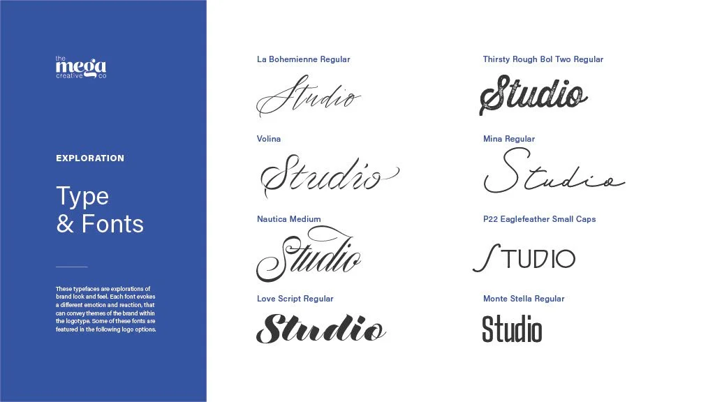
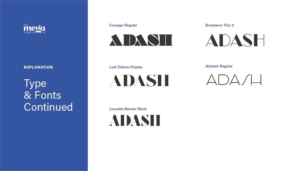
We use Adobe Fonts and Google Fonts as our launching point to collect typography options. Unless a specific preference is established by the client, we like to provide a diverse yet sensible range that includes serif, sans serif, script, and display fonts for style comparison. Note that this is for the logo only. If needing a brand guide that details font usage across your organization for individuals to use in areas like the website, PowerPoints, and Word documents—this is a separate ask. Font(s) used within the logo are always outlined and made into a vector graphic. They are also usually edited further for a custom look. This step prevents a "missing font" error if the text was left as "live."
These above exercises drive ideation and reference points throughout the process. It level sets the exercise and creates a baseline for everyone to start from.
Next, we will select several sketches from the "areas of interest" to vectorize and font explorations to incorporate within the logo. Vectorization is essentially the process of taking the hand-drawn pencil sketches, placing them into Adobe Illustrator on Mac or Adobe Fresco on iPad, outlining/tracing the sketches, and making adjustments to them during this process. All logos are built as a vector (rather than a raster image) which means they are scalable at any size without losing quality. These shapes are geometrically accurate and are based on underlying mathematics.
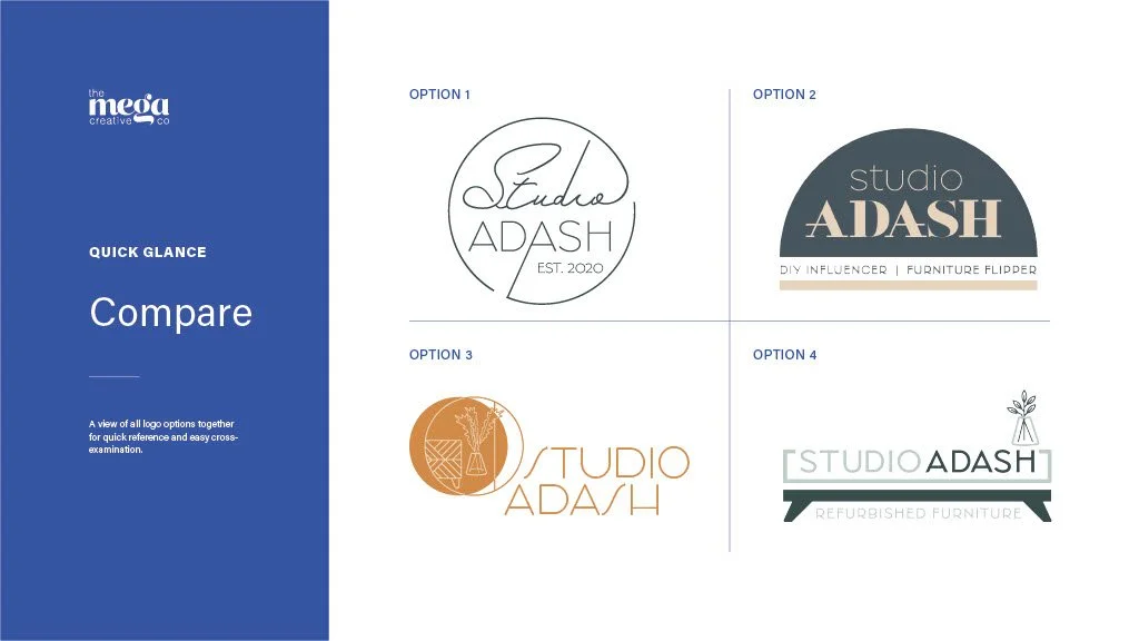
The Mega Creative Company usually vectorizes 1–3 viable options from the sketches. These options are presented only in black/grays/white for the first review session in order to narrow the review to form only. Often times, we will also place the logos into rough mockups to tie them to reality to make visualization easier.
All steps outlined above (audits, sketches, font exploration, vectorized options with mockups) are wrapped into a nice package and presented to the client in a Round 1 Pitch Deck. This pitch deck is typically walked through by The Mega Creative Company in a video call with all necessary stakeholders from the client's team. We use this meeting as an opportunity to explain thought processes, to gauge initial reactions, and to talk through gut-reaction feedback from the client.
Following the pitch meeting, The Mega Creative Company will provide a PDF copy of the Round 1 Pitch Deck via email to the client. The client may use as much time as necessary—while still operating within the agreed upon timeline—to consider the logo options. We suggest you "sleep on it" and let each concept hold an imaginary space of reality within your mind. A feedback-specific follow up meeting may be held after the client has aligned comments from the internal team.
We advise clients to only share and discuss the logo with their key stakeholders at this point in time. While your son may be an artist and your neighbor's best friend likes to read articles about your company's industry—at this point only we know the current brand inside and out. They are not experts in the industry or experts in the design and marketing field. Extending "say-so" can lead to "too many cooks in the kitchen" syndrome—otherwise known as "designing by committee". Our decisions are rooted in both industry knowledge and design best practices. The Mega Creative Company aims to move past personal preferences and whether an individual likes a design or not—we need to insure the design works for the audience, place, and things it interacts with. Can the logo speak to the audience; does it embody the client's mission; does it align with the industry while also differentiating within in; and does it abide by design standards and best practices? Does the logo balance visual complexity; is it built for scalability; and is the overarching idea streamlined into concise symbolism? These are only questions we can answer at this stage.
We see the Round 1 stage as setting a baseline for collecting feedback and reactions from the client. Because of this, we don't view any of the initial logos as a final design—unless of course the client is in love with what they see!
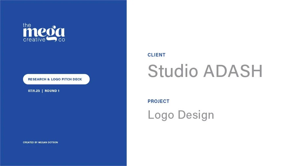
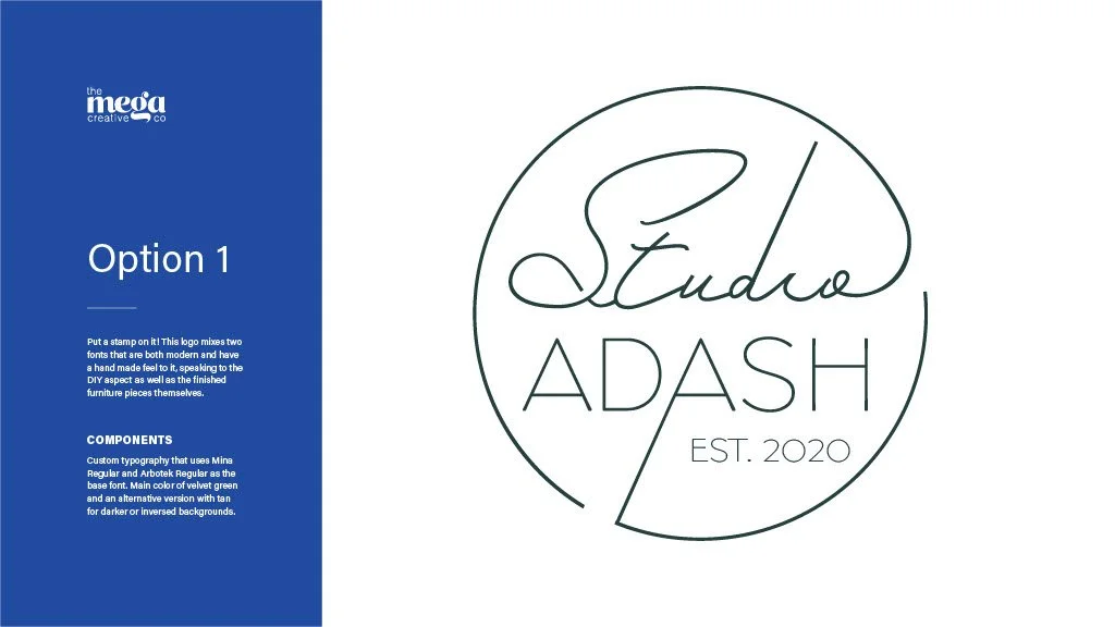
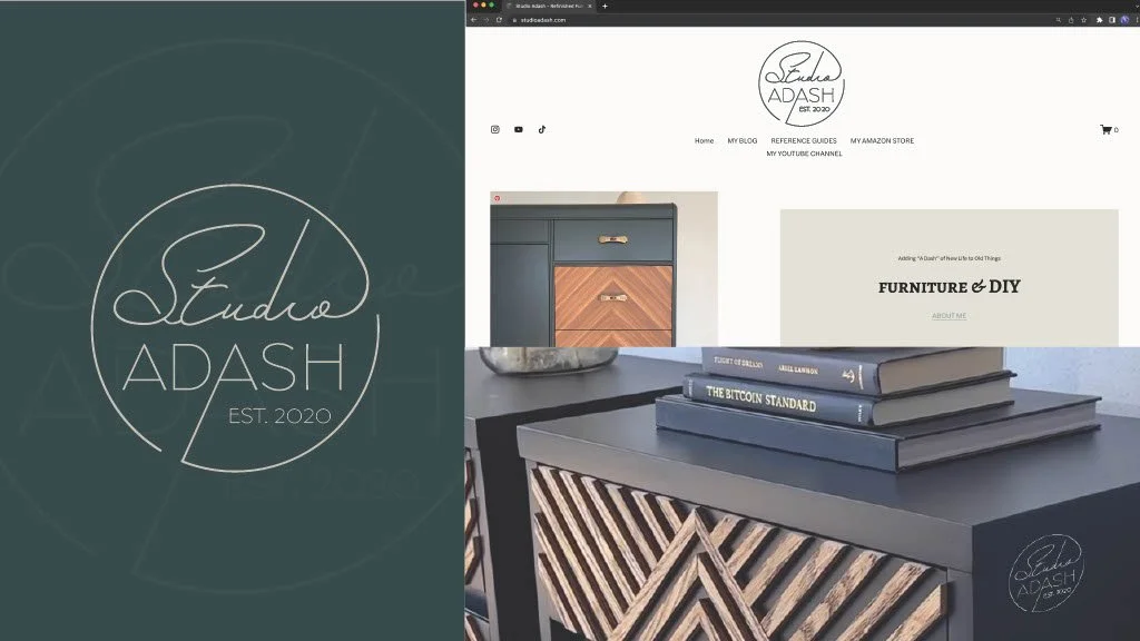
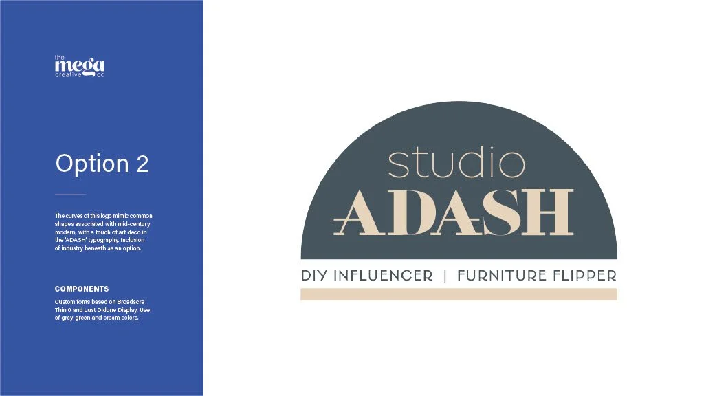
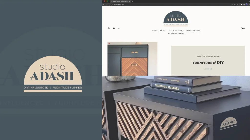
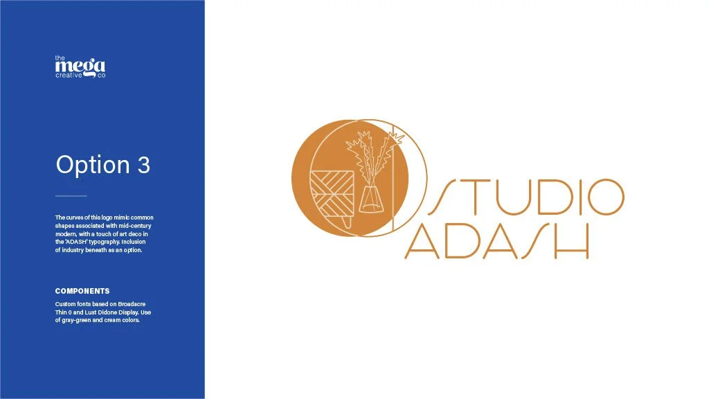
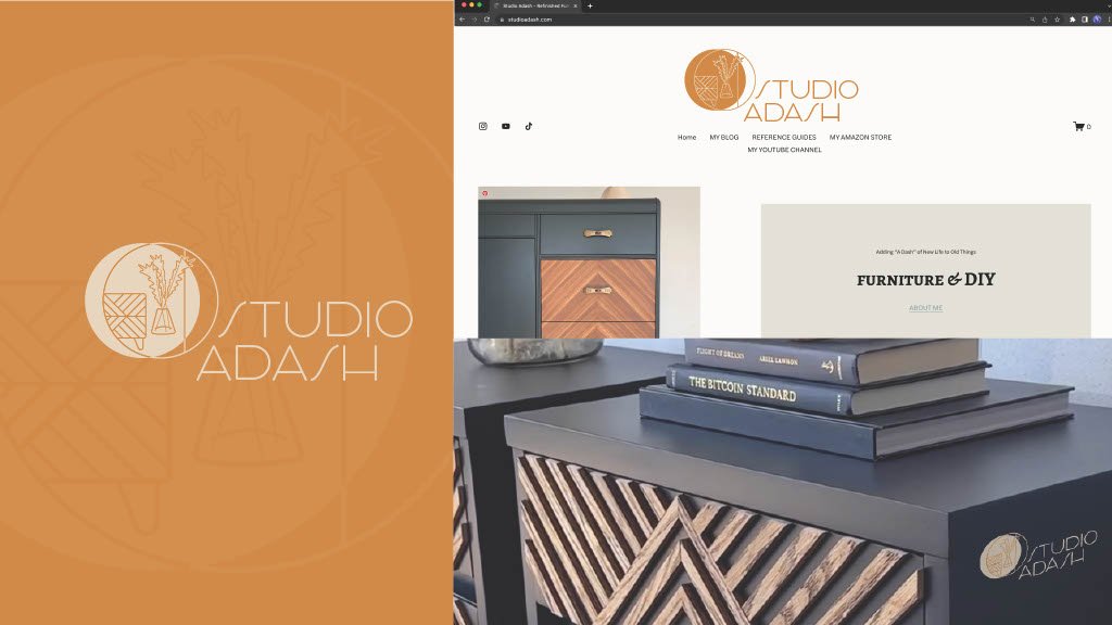
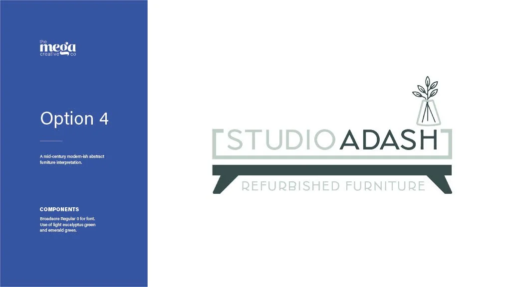
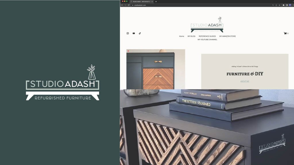
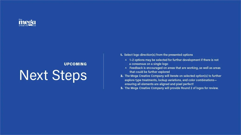
Below is an example of a Round 1 logo Pitch Deck from a previous client, Studio ADASH.
View an additional example of a Round 1 Pitch Deck:
Phase 3: Iterating + Second Pitch Deck
Feedback and open communication channels are immensely valued throughout our partnership. We believe in facilitating a judgement-free zone to share ideas and thoughts. If a stakeholder is unable to pinpoint or explain their thought process, The Mega Creative Company will ask a series of follow up questions to better understand the clients perspective, wants, and needs. Clarity is key.
Once feedback is collected from the client's internal team and provided to The Mega Creative Company, we process the feedback and implement it into revisions. We suggest only 1 logo direction move forward from Round 1—two at the very max should the stakeholder team be truly divided.
From the Round 1 feedback and implemented revisions, a Round 2 Pitch Deck is created. A follow up meeting with all stakeholders to present this pitch deck is preferred, but not required. Color may or may not be integrated into this stage, depending on the type of feedback received in the Round 1 review session.
Phase 4: As-Needed Iterations + Third Pitch Deck
This phase is a repeat of Phase 3, and as-needed depending on the level of feedback received from the client from Round 2 if a logo was not selected/approved. If color was not integrated into the previous rounds and a logo was approved from Round 2, this phase will be solely used for color exploration and application. This phase does not require a meeting, but can hold one upon client request.
Phase 5: Delivering the Deliverables
Phew!
We've made it!
Phases 1–4 may seem like a lot, but not to worry, as most of this happens on The Mega Creative Company's side and in the background to the client. The purpose of detailing the above steps is to establish the process in every minute detail, so the client can truly understand the work involved and the full value we bring to the table.
Now that your logo has been created, we need to give it to you in ways that you can use it every time without fail.
The following file types will be handed over upon final payment receipt by The Mega Creative Company:
PNGs: transparent and high resolution file and built for any medium you may need to use it.
EPSs: this is a vector file format that should be given to professional print vendors—think embroidering the logo on a hat or screen printing it on a shirt. They typically require this file type to be shared.
The native vector file(s), as an Adobe Illustrator (.ai) file
Any additional specific sizes the client already knows they need (ex. sized for a social profile image, website, etc.)
Depending on the approved concept, we also provide the following variations of the logo to be used as needed throughout the brand, depending on spacial requirements per project. These are not options to choose between, but rather part of your brand's ecosystem:
Horizontal element orientation
Vertical or stacked element orientation
Expanded horizontal or vertical element orientation
Emblem only
We also ensure the logo is usable on all background types. So, we provide the logos in all of the following color formats:
Full color
Primary inverse (the primary brand color + white)
Secondary inverse (secondary brand color + white; if applicable)
All white
All black
This typically results in a whopping total of over 60 file exports. Your logo is built to last, to stand against any background, to use in any print or digital capacity, and to be used at any size.
These files are usually provided via a Dropbox link, Google Drive link, or uploaded to a place of the client's choosing.
But what if a client needs more?
We offer unlimited rounds of revisions, charged at an hourly rate. Additional rounds, however, are not common as the proven logo process is optimized for efficiency.
If additional projects are needed—such as a visual identity system defined within brand guidelines, stationery, website, and more—an ad-hoc menu of items are available for contract extensions, pending The Mega Creative Company's production schedule.

